Drivetrain AI is a financial planning and analysis (FP&A) platform that helps businesses with budgeting, forecasting, and reporting. It integrates real-time data from various sources to improve cost control and decision-making. Drivetrain eliminates manual data handling, allowing for faster and more dynamic planning that adapts to business changes. It helps in creating customizable, interactive reports for stakeholders to quickly grasp essential metrics.
As a key Product Designer (1 of 2), I helped shape Drivetrain AI's design system. I designed and implemented core features like the complex formula implementation for metrics, chart color system, AI integration, user management, and model/metric workflows. I also drove improvements to the product's overall user experience and interface within a larger design overhaul.
B2B
AI
Financial Planning & Accounting
My Role
Product Designer — Interaction Design, Visual Design, User Flows, Rapid Prototyping
Year
Jun - Oct 2023
Jul - Nov 2024
Scope of Work
Product Design
Design System
Tools used
Figma
Empowering with Advanced Financial Tools
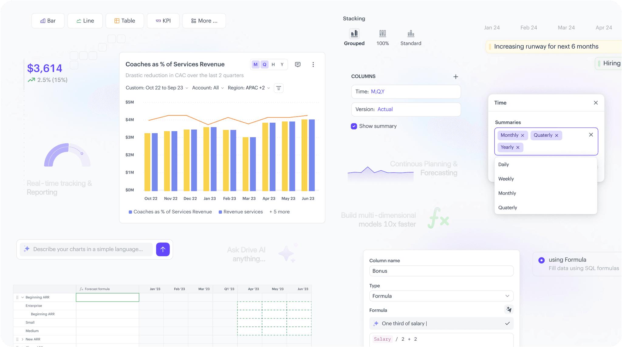
I designed several user-friendly digital tools, including a forecast report builder, financial modeling builder, and Chart Visualization Kit. These tools empowered users to create, customize, and visualize complex calculations, enhancing their ability to make informed financial decisions.
Unified Design System
As a key Product Designer, I built a comprehensive design system in Figma, complete with auto-layout, variants, and styles for text, color, and effects. This system ensured consistency and efficiency across the platform, serving as the foundation for all future designs
Complete user experience overhaul
Following in-depth group research focused on providing a seamless user experience, my primary contributions included designing and implementing user management flows, a complex formula builder, metrics builder, chart visualizations, and comments and sharing functionalities.
Challenge
Drivetrain needed a better user experience to stand out among its competitors in the FP&A software world. We tried to address some key problems including: Writing formulas was too complex, making financial modeling difficult. Chart visualisation didn't align with the brand and appeared dull, hindering data interpretation. Report creation was unintuitive, tables lacked readability, collaboration features (comments/sharing) were cumbersome, and user management was a hassle. These issues created a steep learning curve, slowed finance teams, and ultimately impacted user satisfaction. The existing tools are either legacy systems built with age-old tech, available only to the top-end Enterprises and requiring tedious implementations, or spreadsheets with their obvious limitations and flaws.
Our goal is to contribute to a powerful yet intuitive strategic finance platform, empowering CFOs and finance teams to confidently make data-driven decisions. We focused on delivering a user-friendly, AI-powered FP&A software that accelerates planning, tracking, and forecasting while ensuring flexibility and ease of use. Accessibility was also a key consideration to broaden the platform's reach.

Solution
Drivetrain needed a better user experience to stand out among its competitors in the FP&A software world. To address all the challenges, our research methods included: Domain understanding & design audit of the product, to identify usability issues and areas for improvement. Stakeholder interactions, to gather insights from finance professionals and understand their needs. Competitor analysis, to identify opportunities for differentiation. Review of the product requirements/analytics, to align design decisions with business goals and user behavior.
1
Formula writing & Multi-modeling for efficient forecasting: Previously, the formula writing experience was tedious, and forecasting methods were scattered, making the process difficult and overwhelming. I played a key role in the redesign process to simplify formula creation and unify the forecasting workflow. By focusing on intuitive interactions and clear visual representations, particularly for model tables, we reduced cognitive overload and empowered users to build accurate, adaptable forecasts more efficiently

2
Design System & Chart Visualisation Kit: I was responsible for building the design system in Figma and the chart visualization kit, to transform complex financial data into easily understandable visual narratives. By analyzing the brand's existing palette, understanding color theory, and prioritizing accessibility, I created a harmonious range of core, chromatic colors. The end result transformed tedious data into insightful stories, empowering users to track metrics, compare versions, and analyze values with ease.
3
Report Creation & Collaboration: Initially, Drivetrain AI's report creation was fragmented, with "Boards" and separate "Sheets" (tables) causing a disjointed experience that hindered user onboarding and collaboration. Recognizing this, we conducted root cause analysis and envisioned a simplified, unified reporting experience. This led to the creation of "Reports," a single canvas that combines tables and visualizations into an intuitive interface for seamless collaboration.
4
Leveraging AI for accelaration: We aimed to enhance data analysis, automation, and user interaction by integrating AI. Users needed smarter insights, predictive capabilities, and seamless AI-driven actions. To address this, we implemented natural language processing for queries, AI-powered data transformations, and automated summaries for better decision-making. Additionally, we refined UI feedback and interaction design to make AI-driven insights more accessible and actionable. These improvements made Drivetrain smarter, more efficient, and highly intuitive for users.
5
Conditional formatting: We streamlined data visualization by designing an intuitive rule-based styling system. Users could set dynamic color rules to highlight key metrics, making trends, anomalies, and thresholds instantly recognizable. This improved scannability, reduced cognitive load, and enhanced decision-making, ensuring data was both actionable and visually accessible.
6
Solving for complex User Management: In the RBAC (Role-Based Access Control) revamp for Drivetrain, we focused on improving role management, access transparency, and user permissions. Users faced challenges in understanding and managing access rights, leading to confusion and inefficiencies. To solve this, we redesigned the RBAC UI, making it easier to assign roles, view permissions, and manage users. We also introduced better visibility into access levels, ensuring clarity on who can do what. These improvements made access control more intuitive, efficient, and secure.
7
Reconciliation: I led defining reconciliation workflow of Drivetrain. We tackled data sync failures, expired credentials, and error visibility issues. Users struggled with interrupted access and unclear error messages. To fix this, we added a re-authentication workflow, improved error notifications, and ensured previously synced data remained accessible. We also refined UI feedback for partial sync failures, helping users quickly resolve issues. These changes made data reconciliation smoother, clearer, and more reliable.
8
Data sync: Users faced issues like failed syncs due to system errors, authentication failures, or third-party service disruptions, often without clear feedback on what went wrong. Additionally, partial sync failures at a table level led to inconsistent data, making it difficult for users to determine what needed fixing. To solve this, we introduced clearer error messages, improved retry mechanisms, and better UI indicators for sync statuses. Users were also given access to previously synced data even when new syncs failed, ensuring they could continue their work uninterrupted.
Retrospective
The Drivetrain project was more than just a product build—it was a deep dive into solving real problems for real people. It reminded me that great design isn’t just about aesthetics or efficiency, but about understanding users, their workflows, and their frustrations.
Throughout this journey, I honed my skills in user research, interaction design, and simplifying complexity, always striving to make advanced AI and data modeling feel natural and intuitive. I learned the importance of listening—really listening—to how people work, so we could craft solutions that fit seamlessly into their day.
The process was messy at times—whiteboards full of scribbles, countless sticky notes, endless iterations. But therein lay the magic. Watching ideas turn into meaningful, impactful experiences was incredibly rewarding. This project reinforced my belief that the best designs aren’t just functional—they make life easier, decisions clearer, and work more enjoyable.


Your scrollable content goes here
Coming soon to Mobile
My mobile version is in the works! In the meantime, explore the magic of my portfolio’s web version.
Want to have a chat while you're here?
Write a message